The Process
We were able to start with precise branding guidelines and clear rules for their typography and colors. The first step was to make sure the sizes would work with the printer and the event's own measurements.
After that, we chose the placement of the doors, TVs and vinyl signs that were going to be put on top of the design created.
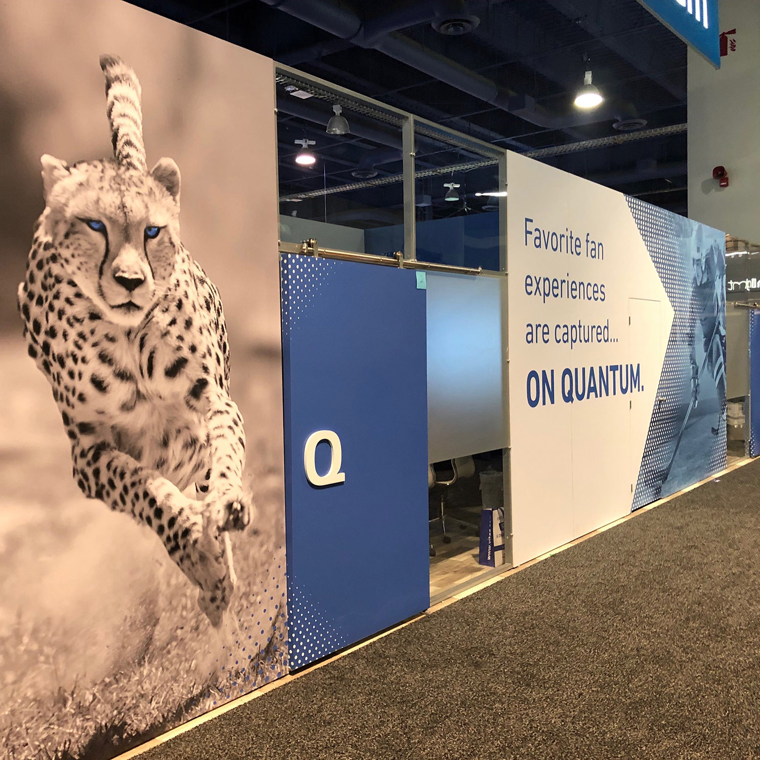
Starting with a design in Illustrator in 2D with real measurements, we applied bold and contrasted colors, angular designs and data-inspired patterns. Impactful pictures were selected to demonstrate speed and strength, adding the brand's iconic blue color as an accent.
Before printing though, we created a 3D mockup with real measurements to pre-visualize the designs, adding as much detail as possible in order to add realism. Particularly, the position of the TVs and vinyls that needed to be on top was very important.


